Retention Analytics: Why Users Stay and Why They Leave

Retention isn’t a dashboard vanity metric; it’s the quiet compounding engine behind sustainable growth. When customers come back—week after week, month after month—acquisition spend works harder, lifetime value rises, and forecasting gets saner. Decades of work in loyalty economics show that even modest retention lift can drive outsize profitability, because repeat customers buy more, cost less to serve, and refer others. See Bain’s perspective on loyalty economics for a primer.
What “retention” really measures
At heart, retention is proof that your product regularly delivers perceived value with low friction. Think of it as three questions you’re answering with data:
- Fit: Did the user find what they came for—fast?
- Habit: Does value recur on a natural cadence?
- Experience: Is the path free of frustrating effort?
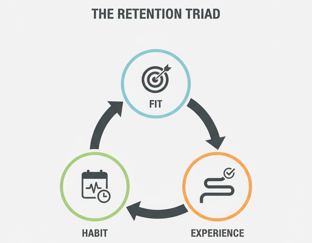
On that last point, research shows that reducing customer effort is a stronger predictor of loyalty than sprinkling “delight.” It’s the grind, not the glitter, that decides who stays.
Lenses that clarify retention
1) Cohorts over averages
Averages hide truth; cohorts show it. Looking at people who started in the same time window and tracking how many return by Day 1/7/30 reveals your true retention curve, seasonality, and the shape of decay. If your day-7 curve flattens, you’ve likely found a habit loop; if it keeps sliding, activation wasn’t sticky. For a quick conceptual reference, review Google’s Cohort exploration help to see the logic of grouping and follow-up windows.
2) Satisfaction → loyalty (but with nuance)
High satisfaction correlates with loyalty and better financial outcomes across industries, but correlation isn’t automatic causation. Satisfaction signals that value perception and expectations are aligned—prerequisites for retention. The American Customer Satisfaction Index has long documented these links across sectors.
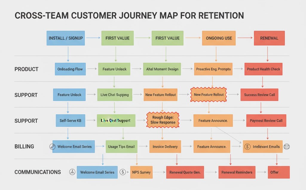
3) Journeys, not touchpoints
Retention is often won or lost between steps—install → first value, trial → first success, payment → first renewal. Orchestration across channels (product, support, billing, comms) matters more than any single “moment.” McKinsey’s work on end-to-end journeys shows why companies that align the whole path see meaningful gains in satisfaction and commercial outcomes.
4) Personal relevance compounds
Personalization that actually helps (right message, right time, right channel) increases engagement and the odds of forming a usage habit. Retail is a useful bellwether: better experience and personalization correlate with higher conversion and engagement.
Leading indicators of staying (and leaving)
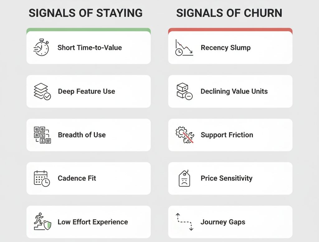
Signals of staying power
- Time-to-value (TTV): Short TTV from signup/first visit to the “aha” outcome.
- Depth of use: Engagement with features that represent core value, not just surface clicks.
- Breadth of use: More than one jobs-to-be-done met (e.g., create + collaborate; browse + save).
- Cadence fit: Activity aligns with the product’s natural rhythm (daily, weekly, monthly).
- Low effort: Few error loops, quick resolution, smooth billing renewals.
Signals of impending churn
- Recency slump: Days since last meaningful action creeping up.
- Value-unit decline: Fewer items watched, documents created, orders placed—despite visits.
- Support friction: Multiple contacts, escalations, or long time-to-resolve.
- Price sensitivity spikes: Discount-only activity or downgrade exploration.
- Journey gaps: Users complete step 1 but stall at step 2 (classic activation gap).
Why users stay
- They get to value quickly, and repeatedly. The core job is obvious and dependable.
- The path feels easy. Less cognitive load, fewer steps, faster resolution. (Customer effort research backs this.)
- The product fits their cadence. Notifications and prompts align with when they naturally need it.
- Identity & habit form. Using you becomes “how I do this task,” not a negotiation each time.
- Switching feels pointless. Either because outcomes are superior or alternatives feel riskier.
Why users leave
- Value gap: The promise that brought them in isn’t what they experience after signup.
- Friction spikes: A few painful episodes—failed imports, confusing roles/permissions, surprise fees—can outweigh months of good use.
- Misaligned intent: Acquisition channels over-promise for audiences with different jobs-to-be-done.
- Context shifts: Budget cuts, org changes, seasonality, or job role changes reduce relevance.
- Trust breaks: Billing surprises or security concerns erode willingness to stay.
Diagnostics to separate signal from noise
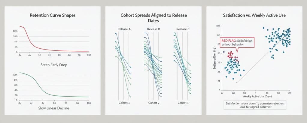
- Retention curve shape: A sharp early drop suggests activation problems; a slow, linear decline points to weak habit or seasonal use cases.
- Cohort spreads: If some start months retain far better, look for product or policy changes then (pricing, onboarding, messaging). Reference the cohort lens to structure that view.
- Experience vs. outcome mapping: Pair quantitative patterns with qualitative evidence—session replays, interviews, open-text reasons—to locate the friction versus value gap.
- Satisfaction as a compass, not a KPI trophy: Elevated satisfaction without behavior change is a red flag; satisfaction that coincides with shorter TTV and higher weekly active usage is the keeper. See ACSI for the broader linkage.
- Journey consistency: If NPS is high after support but retention is low, step back and audit the whole journey for rough edges between teams.
Interpreting retention in context
Avoid universal benchmarks. A daily news app, a B2B finance tool, and a seasonal marketplace will each have different “healthy” curves. What’s comparable is the direction of your own curve as you improve activation, reduce effort, and increase relevance.
Remember also that “customer retention” and “revenue retention” tell different stories. It’s possible to lose many light users while expanding revenue from heavy users (great for finances, risky for market breadth). That’s why pairing behavioral retention with revenue metrics and satisfaction signals yields a fuller picture of durability. For the economic intuition behind why this mix matters, see Bain’s loyalty economics discussion.
Bottom line
People stay when they quickly achieve outcomes that matter to them, on a repeatable rhythm, with low effort and high trust along the journey. People leave when any of those pillars fails—value isn’t real, cadence doesn’t fit, or friction makes each visit a chore.
So use retention analytics to answer the only question that counts: Are we making it easier and more worthwhile for the right customers to succeed, again and again? If the curve says yes—and your cohorts, satisfaction, and journeys agree—you’re building something that lasts. And if not, your data isn’t scolding you; it’s pointing to exactly where users need you to do better.
Rajeev Sharma
Web analytics consultant and privacy-focused tracking specialist with over 10 years of experience. Helping businesses build measurement systems that work — without compromising user trust.
Learn more →